Cleveland SC: Tying the Club to the City
Cleveland may not seem like a soccer hotbed to the uninformed, but the roots of soccer go way back in northern Ohio history. The first league in the area was founded in 1906 after a series of international club friendlies were held in the area. Up until the 30s, soccer continued to expand in Cleveland. But much like the rest of the country during this era, interest in the sport slowed to a trickle. Only a few high schools kept the sport alive in the northern Ohio until the mid 60s, when professional soccer returned to the city. Always in a limited scope, soccer continued to survive over the next 2 decades, but eventually organized soccer was reduced to almost nothing. That all changed this year.
Cleveland Soccer Club was founded in 2018, after the owner, Samuel Seibert, met with a group of former players who wanted to ensure that competitive men’s soccer would be represented in Cleveland. After applying and being accepted into the NPSL, the club was a quick study and showed its quality. CSC finished 2nd in the regular season of the East Conference Division, trailing only Erie in the standings (by only 3 points). Cleveland got its revenge in the playoffs, knocking Erie out 4-0 in the club’s first visit to the postseason. CSC’s run would end in their next match, losing 1-0 to Ann Arbor. All this success reflects a club prepared from day one to compete. That preparation wasn’t limited to the field, it also showed up in Cleveland SC’s focus on design and brand management.
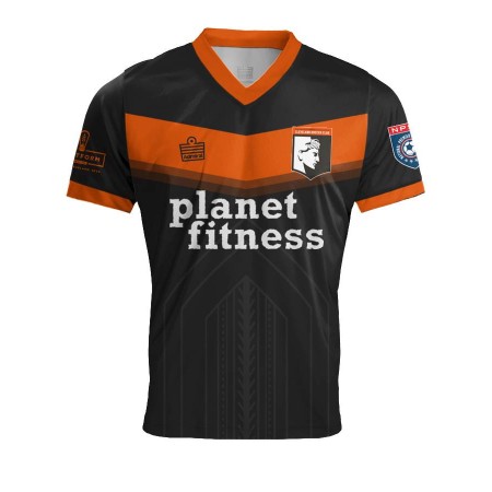
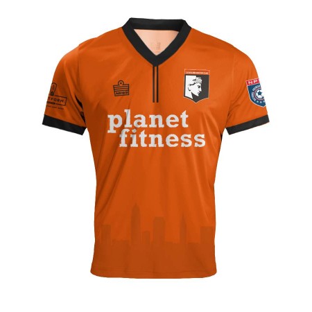
The kit colors are orange and black and the owner picked these for 2 specific reasons. “First, orange and black is a unique color combo within the NPSL and we wanted to make sure that our colors stood out from the crowd. Second, the orange was chosen as a way for Samuel to pay homage to the orange skies that are seen over the lake during many summer evenings in Cleveland.” An outside observer might assume some connection to a different kind of football team, but the club wasn’t inspired by the Browns according to the club.
The away kits for the club sport a pattern of orange chevrons over a black background. The chevrons were chosen to include the geography of the Lake Erie shoreline. The shape of the coast is in a “V” and the chevrons were inspired by shape of the coast. This sort of thinking came from preparation and focus in the development stage. The club leadership lists two principles they used in creating their kits - “First, we want to be a brand that represents the city in a positive manner. This is something that guides both our branding and strategic decisions that we make as a club. From the crest to the jersey and onto the promotional graphics that we use, we always aim to incorporate elements or views of the city. Second, our graphics should be clean and easily readable.” Outside of the crest, the remainder of the club’s overall look and branding were developed by the club’s Creative Director, Cory Mizer.
And what a crest! The eye-catching color combination is paired with a beautiful and distinct crest, a personal favorite of mine. The crest was designed by Mike Kubinski of CLE Clothing Company. The design features the face of the iconic Guardians of Traffic statues that stand guard over the Hope Memorial Bridge in Cleveland. In addition to featuring an iconic symbol of the city, the badge includes the name over the top of the badge as well as the founding year of the club.
Tying the local geography and city infrastructure to the kit permanently brands the club with the city. The two must coexist and support each other to contribute to the growth of soccer in the area. A simple look into Cleveland’s soccer history shows that the area loves soccer - pair that with a club who lets its kits show its love for Cleveland. That’s a match made in creative soccer heaven!
- Dan Vaughn


