Clad in Blue and Green
Following a conference-winning season with storied British brand Admiral Sportswear, Duluth FC turned to Stimulus Athletic for a more local touch as it looked to rebrand for 2018. Having already teamed up with KJ Branded for a new badge and revamped merchandise, the club continued its creative relationship with the experienced soccer designer for its 2018 kits, which would then be produced by Stimulus Athletic.
KJ Branded and its founder Kevin Joseph, have a long history of designing in the beautiful game. From creating the original crest for the Minnesota Stars of the NASL- used for one season before rebranding to Minnesota United -to producing logos for the American Outlaws chapters in Minneapolis-St. Paul, Knoxville, Washington DC, and the Twin Ports (Duluth, MN and Superior, WI), KJ Branded came into its new role as a creative force for Duluth FC that could make the club’s look match the ever improving standards of the league, the conference, and the competition.
Charlie Forsyth, the club’s Creative and Marketing Director, stressed the importance of looking like an organized club for those on and off the pitch, “I think it's been extremely important [to look professional], not only are we pushing our new brand further but it also helps in recruiting players and landing new sponsorship deals… The amount of work the front office and volunteers put into this team is justified when the team travels and plays games looking professional. The amount of time Kevin and I put into this rebrand was exhausting, but when you look at what the team did this year and the way they looked doing it, I would do it all over again.”
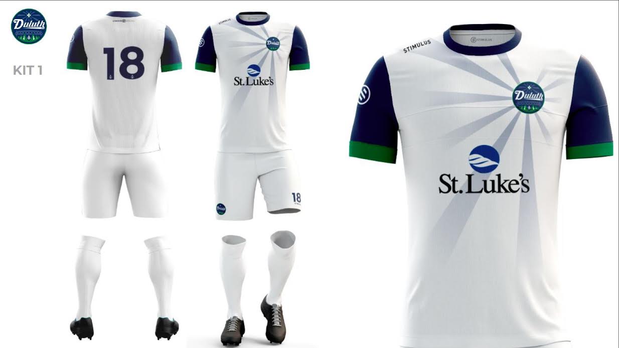
The home kit kept things simple with a white body and shorts, a light blue sun ray sprouting from the badge, and blue sleeves with a green trim. This is the kit that would feature in front of home crowds and several of Duluth’s playoff matches. While simplistic, the kit managed to achieve that simplicity without losing a sense of professionalism when it came to appearance and manufacturing.
The away kit focused more on the club’s colors of blue and green, featuring a blue body with a lighter blue bridge running down through the badge like a stripe, green trim on the sleeves, and green shorts. Celebrating those colors has certainly always been a goal for the club and if this kit accomplishes anything, it’s that.
The primary keeper kit was a variation of the away top with lime green replacing the blue and a grey bridge while the secondary keeper kit featured a red variation of the primary kit’s top.
Having seen the all of the kits in person on quite a few occasions, the effect of this new and crisp look was clear from day one to the final farewells. This is a club that, despite being one of many clubs in its conference with intensely humble beginnings, competed in a regional final and traveled across the nation to compete against Miami FC in a league semi-final. Lower league or not, these events are the sort that carry an expectation to bring your best in every department. While Duluth FC and its ambitious color primary color pairing of blue and green has always found its way to a good set of kits each season, the partnerships with KJ Branded and Stimulus Athletic truly signal a leap in quality.
Unique colors and a unique look can go a long way in a lower league environment still finding its place in the style community and with other North clubs like Minneapolis City drawing attention, Duluth has successfully earned its place in the conversation. Best of all, it’s been done with the help of a local company and soccer-passionate designers with similarly local roots.


