Designed Beyond Regional
Designed beyond Regional
I think there’s this idea that permeates our culture. It’s not just soccer, but everywhere, this idea that if you’re regional or local, you probably aren’t as good as the big name brands that we all recognize. Happens all the time in the time when I’m grocery shopping. I skip over one brand because I don’t know it and instead pick up one that I’m more comfortable with. I won’t deny that I can think of some fields/markets where this is changing. Beer has gone through a massive revolution thanks to local guys churning out great beer as part of the craft beer revolution. But that is only a tiny part of the market, the tip of a trend, not really a market-wide changer.
In soccer, this happens when local clubs get passed over because the consumer makes the assumption that local means unpolished and not worth the investment. Again, this is changing, but incredibly slowly. Supporting local soccer has become a bit of a rallying cry for soccer fans across the country who are tired of being forced to watch international clubs or MLS sides if they want to watch soccer. So many clubs have popped up across the nation, the tiny investment of $5 or $10 can get you an authentic experience supporting a local side. Regional soccer is expanding rapidly and some of these local clubs seem to understand the importance of standards. The chance to make a good first impression is a priority for the successful clubs, the ones who get it. Having a smart badge, a slick kit, a solid social media strategy, all of these pave the path to success. All of us at Protagonist have become obsessed with one such club, a tiny regional start-up, who understand the importance of design: Monmouth Light.
THAT BADGE THO
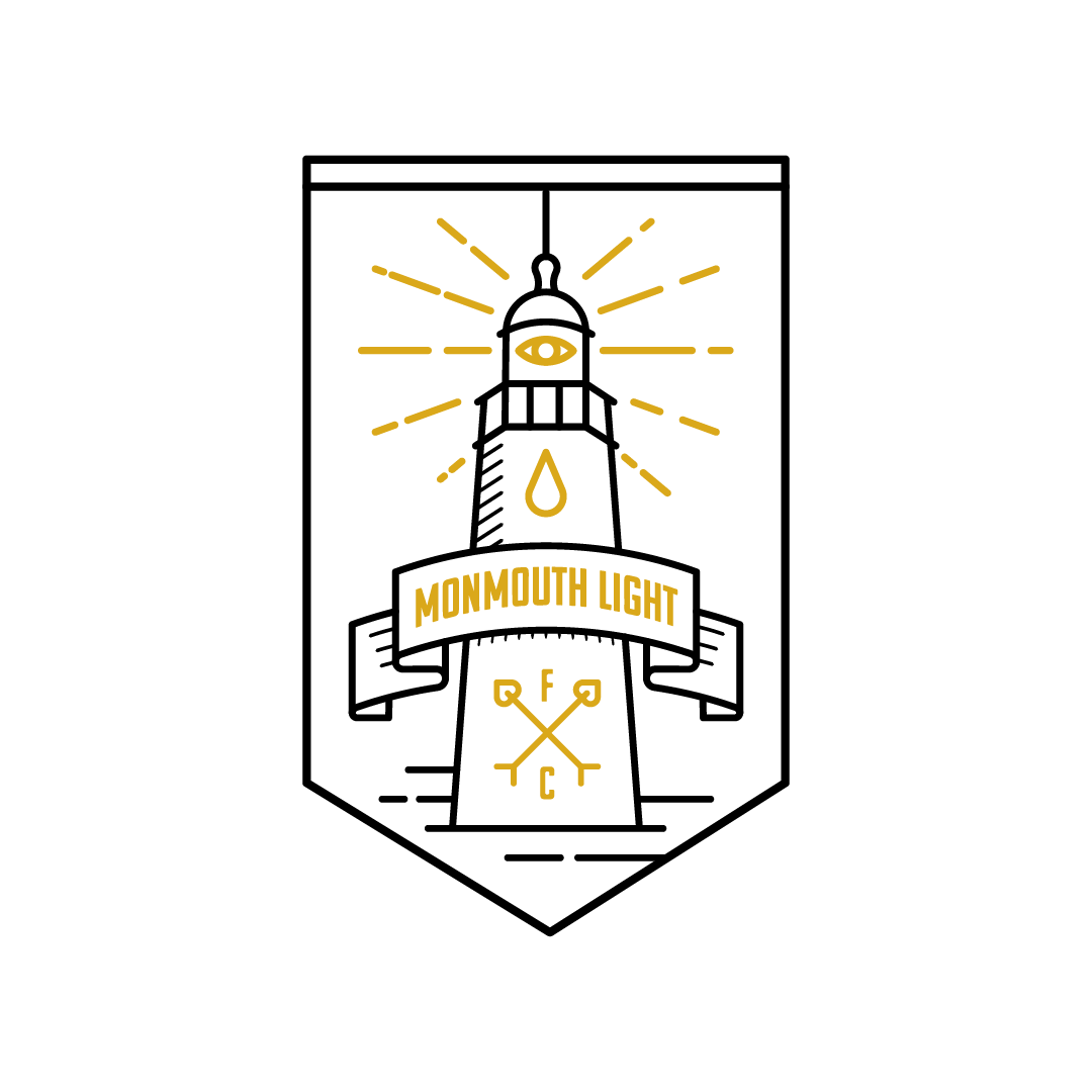
If you want an intense first-hand history of the club, I would definitely hitting up our Spotlight piece on Monmouth. But for now, let’s focus on one of the best lower tier badges in the game. Monmouth plays in the Garden State Soccer League in Monmouth County, New Jersey. That county has the most lighthouses of any county in the state, but the image of the lighthouse goes a little beyond the literal. According to Joey Dicamillo, founder of the club, “the “Light” is just actually an abstract concept for positive energy, and the All Seeing Eye on the crest and on the left short leg is symbolic of us spreading that “Light” into the world much like a cult, or the Illuminati.” Most clubs do not dig this deep when designing their crests, but maybe they should start doing it, considering how polished and sharp this result is.
The image is memorable and eye-catching, designed by London-based artist, Aimee Capstick. She primarily works with Romance FC, but took the time to generate an absolute banger of a badge. The colors are two-tone but not dull, the design is simple but still pleasing to look at. It’s a masterwork in design and should be considered one of the best in regional soccer.
THE THREADS
Disclaimer here, Rob from Icarus (who also sponsors this column) designed these kits, but if you think that shaped why we picked these kits, open your eyes. It’s one thing to look sharp on the field, these look great in every setting. As Rob puts it, “we were going for a cross between the Illuminati and the Great Gatsby.” Joey mirrors this sentiment when discussing the details of the numbers and lettering on the kit. “The Font was completely art-deco and almost 1920’s gatsby esque-again just wanted to go with pure class, and something that would be almost eternal feeling just like the greco roman design inspiration. Aesthetically I was going for a very classy look, wanted to have a slight call back to my mom who came to America from Rome, there is a slight greco roman style vibe in the all over print on both kits.”
This isn’t just a soccer kit, this is a badass shirt that can be worn anywhere with pride. It’s sharp, it’s modern, it’s throwback, it’s all those things and maybe something more, it’s regional.
THE WRAP
It’s easy to write something off as regional, lower-tier, amatuer, whatever insult you want, but when it looks this good, this polished, this well-designed, it’s difficult to ignore. What Icarus and Monmouth have created here is a work of art that can’t be ignored. There may be better kits when it comes to how they look on the field with a set of shorts and cleats, but I challenge you to find something that looks cooler than this beautiful piece of regional soccer. This guy certainly thinks so.


