Kick It Off With a Bang
During the winter months, leagues take care of all the business that the regular season crowds out. League meetings, player tryouts, kit redesigns, almost anything you can think of happens when the weather outside is inhospitable in most parts of the country. One of those pieces of business is adding clubs. Whether through introducing a brand new club or adding on an established club who is jumping from one league to the next, expansion offers a spotlight on clubs, mostly through their crests (because most have a limited track record on the field). With all the announcements from league after league, we decided to put together a short list of some of our favorite badges from expansion sides this winter. Enjoy!
- Dan Vaughn
Dan Vaughn
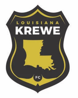
Louisiana Krewe FC - Lafayette, LA - GCPL
I’m a sucker for maps. The shapes of states, cities, countries, you name it, love that stuff. This crest features the shape of Louisiana on a gray/black background. The name of the club is featured above the state with the smaller “FC” below. Rather than a round shape, the crest is almost the shape of a police or fireman badge, with the three points on top and the single point at the bottom. The colors are very much in line with the NFL’s Saints, connecting the club to familiar territory for Louisiana sports fans. By the way, Krewe is a term for a group of people that put together a float in a carnival (much like in Mardis Gras). It’s a sharp badge and I can’t wait to see the uniforms that will feature it.
Steven Ramirez
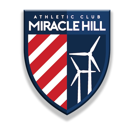
AC Miracle Hill - Desert Hot Springs, CA - UPSL Western Conference
If you live in Southern California and have made the drive through the desert, you have been faced by many giants that ruled in Don Quixote's time. The Southern California desert hosts a wind farm that contains over 4,000 windmills and is known to many travelers. When creating a crest for this Desert Hot Springs club, nothing makes more sense than those towering windmills. Using the “Athletic Club” moniker applies a traditional naming convention that is sporadically used in the world, especially in the U.S. soccer sphere. In their first year of existence this UPSL crest jumps out as one of the best in the league.
Aarik Long
Chattanooga Red Wolves - Chattanooga, TN - USL League One
I was at Edley’s BBQ on November 15th to witness to unveil of this logo for Protagonist Soccer. The atmosphere inside of the restaurant was incredible. When the crest was finally unveiled, there seemed to be a positive response inside the building. However, people have seemed to not agree online. It’s been mocked repeatedly, but I think it’s a great crest. To begin with, I love that red is the primary color. It’s pretty common and maybe a little cliche, but there’s nothing like a cross-town, red vs blue rivalry. The wolf looks great. It isn’t a goofy cartoon canine, but it also is not overly realistic. The overall shape of the badge looks really nice, as well. The spikes at the bottom aren’t very common among crests, so the unique shape is refreshing. Some of the reasonings behind different parts of the logo seemed like a little bit of a stretch, but I think the crest itself is extremely solid and among the best in USL League One.
Dab Williams
Contra Costa FC - Concord, CA - UPSL
The round of expansion teams for Spring 2019 hasn’t impressed me much, honestly. Don’t get me wrong, they might be great on the field, but artistically and stylistically I’ve been underwhelmed. Contra Costa FC was a breath of fresh air. CCFC’s badge is in the shape of the Union Pacific logo and features a similar design with the white and red stripes across the base of the badge. The top of the badge features some mountains, the name and, outside the limits of the badge, is the star, which I assume is from winning the Liga NorCal Copa Cup championship in May 2018. Across the front of the crest is a soccer ball with wings (not my favorite feature of this one), completing the look of the badge. I love the color palate, love the shape, it’s the best of the UPSL expansion clubs, without a doubt.


