New Look Same Club

The identity of a club is often overlooked, but often it plays an essential role on how we feel about a club. A fan should embrace the identity, but a player must live with it and become an ambassador for that said identity. That is why the crest of a soccer kit lays over our hearts. A brands identity is one with the fan, the player and the community.

The new uniform will give us a breath of fresh air.
— Anthony Perez

In this week’s Uniformity we travel to Perris, CA to check out the new brand refresh for City Legends FC. City Legends FC is a sophomore club within the UPSL. In its first year the club went undefeated in the Championship and were promoted to the Pro Premier. The club’s identity wasn’t bad. It had a well done crest and a color palette that sticks out in the soccer world: maroon and gold. But 2019 was meant to be a bigger year for the club, and a bigger year meant an even better presentation. “ Once we jumped up to the Pro Premier, we didn't start off that great,” said Anthony Perez about the new year and new identity. He added “ I thought a refresher, the new logo and new uniforms, would spark us up again.”

The Crest

city legends.png

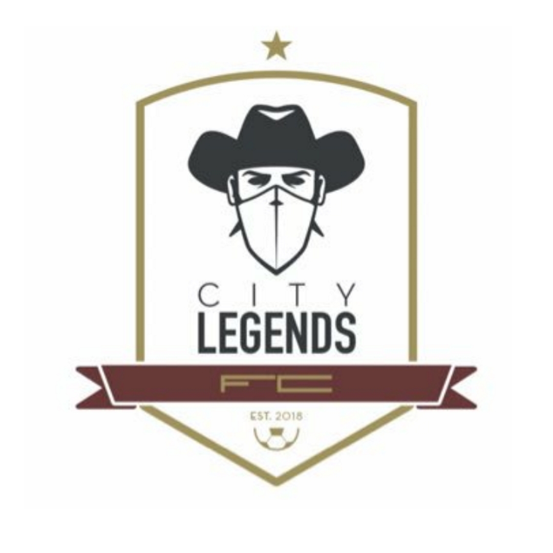
The original crest had a unique shape and was drenched in maroon, the clubs primary color. It was a bold crest fit for the desert city of Perris, CA. The bandit became the icon for the club, equipped with his western style cowboy hat. The crest itself gave the team an identity, but just because something works doesn’t mean that it can't get any better. Because it did.

city legends 2.jpg

The new crest is sleek and designed in a minimal fashion. Every adjustment has made this crest more appealing. The shape is more defined and offers a stronger frame. The maroon acts as an accented color, rather than dominating the space. The use of negative space helps the badge breathe. The font variances help create symmetry and balance within the piece. And the bandit still makes his appearance, but he is bolder and more experienced because he has that undefeated season under him.

We wanted to keep the base of our logo, so we just freshened it up a little. We made look cleaner. We made it look sleeker.
— Anthony Perez

The Uniform

In soccer a new season often means a new uniform. Most pro clubs will often trot out different color variants to the same template, but in grassroots soccer you often see an explosion of creativity. That was how Uniformity was born.

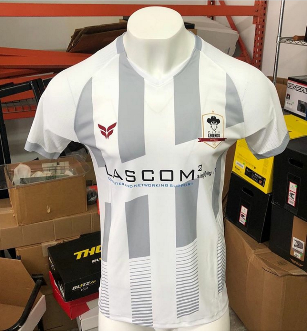
The new City Legends uniforms look great. The design is sleek and matches the new identity that the club is creating. The alternate colored stripes give a classic feel to the kit, but the fade at the bottom gives a cool modern twist to the outfit. One element that stands out is the diagonal hoop. It’s just another element that slightly changes the jersey traditions of old.

My favorite is the white, mostly with how well the badge fits in and how the maroon accents just give another strong element to look at. Those two extra elements provide a balance to the overall kit that the black can’t match.

The new design helps to usher in a new era for the City Legends. An era that has attracted a jersey sponsor in Lascom IT, who believe in the project that this club is creating for its community. A new uniform isn’t always about style, but about growth. City Legends Football Club is stepping away from being a soccer team and stepping into the identity of a soccer program. A soccer program that has the potential to truly develop a soccer community.

Bugeaters FC: The Simple Things

One of the best secondary things about the return of soccer across this country is the debut of all the kit rebrands and releases going on all over the country. Of course, we track those as they happen and so far we’ve seen some strong contenders out of the box. Last week we saw another redesign from an up and coming brand (one that we’ve written about in this very column) and we were thrilled to be able to head back to the great state of Nebraska to double dip with Bugeaters FC.

GPPL.jpeg

We usually begin out Uni-Formity pieces by talking about the brand and what’s going on with the club, but because we’ve written about them already, we can skim that subject just a little. Bugeaters have had some big announcements in the last 6 months. The biggest of those announcements was their exit from the UPSL, after a single season of competition, and their decision to join the brand new expansion division of Gulf Coast Premier League, the Great Plains Premier League. While Bugeaters had only played a single season in the UPSL, they have a larger footprint in the national conversation due to their creative approach to marketing, advertising and strategic partnerships. So their exit from one league and eventual (GPPL plans to kick off in 2020) entry into another league made a big splash, even with the most passive of lower league followers. Paired with their league transition, Bugeaters announced they would be playing a season of friendlies, rather than participating in league play in 2019.

Then three weeks ago, Bugeaters announced a partnership with Creighton University to play in Morrison Stadium for their home 2019 matches. The drive to find a place to play matches had been a tough one for Bugeaters FC owner Jonathan Collura. But having a home in Omaha had more benefits than just a field to play on. “We are excited to be playing at Morrison Stadium. This venue has all of the amenities that we have needed. We expect it to be multi-season, but we need to focus on being good tenants. Omaha has two top division one programs and we are excited to have ties to both of them.” Playing matches in a college field is sure to attract some potential players to the eye-catching Bugeaters brand.

And that brand was taken up a notch last week with a kit reveal that had social media buzzing.

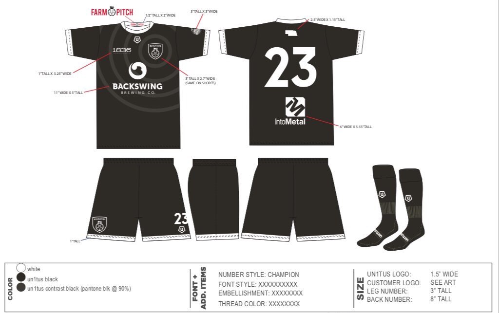
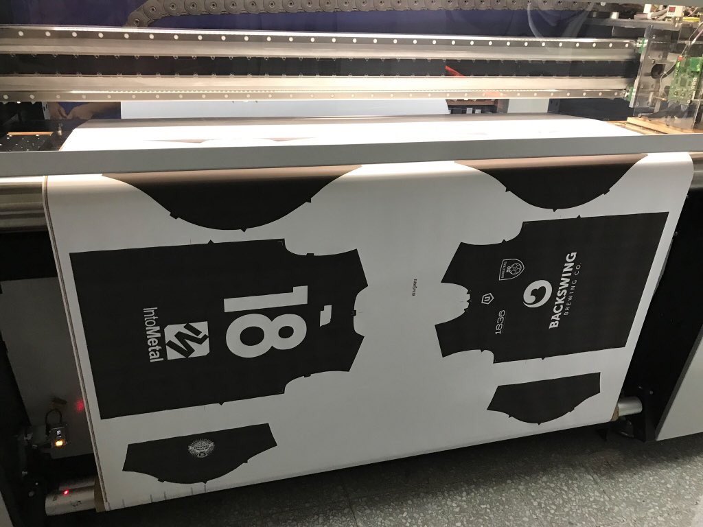
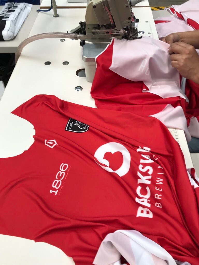
Jonathan Collura always thinks about the details when it comes to his branding and these kits are no different. The black home kit features a black background with a zig zag pattern in a barely seen gray. All the elements of the kit are white, with piping on the neck and sleeves. Over the shoulder, there’s two parallel lines, almost football (American) in style. Those really stand out on this all black kit, giving definition and shape to the shoulder area. Those lines can also be be spotted in the red away kit, which is a red kit with three white stripes. That white extends to piping on the collar, sleeves, and shorts. The badges, unlike many kits at this level, are actually woven versus sublimated, it’s a classy touch, particularly at this price point. But in the end, both designs are simple, through and through. And that approach by Collura, who partnered with CustomFC on this kit, is on purpose.

“I have been collecting kits since the mid-90’s and my style is based on what I have found to have wide appeal. Unique simplicity is what I think does well. Last season’s kits did well and we used simple elements with solid kits. This season, we again use simple elements but in a unique way. I like unique designs and as you have seen, we have had bespoke kits both last season and now this season. There are simple things that can be done to enhance the look. We put the shape of the state on the back neckline as an example. We are not tied to an academy and required to use stock kits. This allows us to have the flexibility to do what we want.”

Danny Whitehall sprints up the field for Bugeaters FC. Image courtesy of John Peterson.

Danny Whitehall sprints up the field for Bugeaters FC. Image courtesy of John Peterson.

With such a buzz around the release of the kits, the Bugeaters owner could have jacked his prices a bit, but he broke the mold on this subject as well. “I believe in giving fans a sub-$50 kit. Let’s face it, no club makes much money on kits (at this level anyway), so why not do what you can to get them in to the hands of the fans?” Why not indeed.

With the kit release announced and the preorders rolling in, Collura’s vision is turned to what’s next. “We have an amazing season lined up. We’ve had one ‘tune up’ match which went well and we fully expect this season to be a step up to last. The team will boast a squad with all Nebraska connections. My new coach, Scott Robertson, buys in to the philosophy of building a community based club. The next couple of weeks will be a big challenge. We have both Little Rock Rangers and Chattanooga FC back-to-back weekends. I’m excited and confident that we can complete against such top sides.”

If not on the field, certainly in the way they are dressed.

- Dan Vaughn

Rebranding for Authenticity

For clarity, Icarus FC does advertise with our site. It just so happens they keep making the freshest kits!

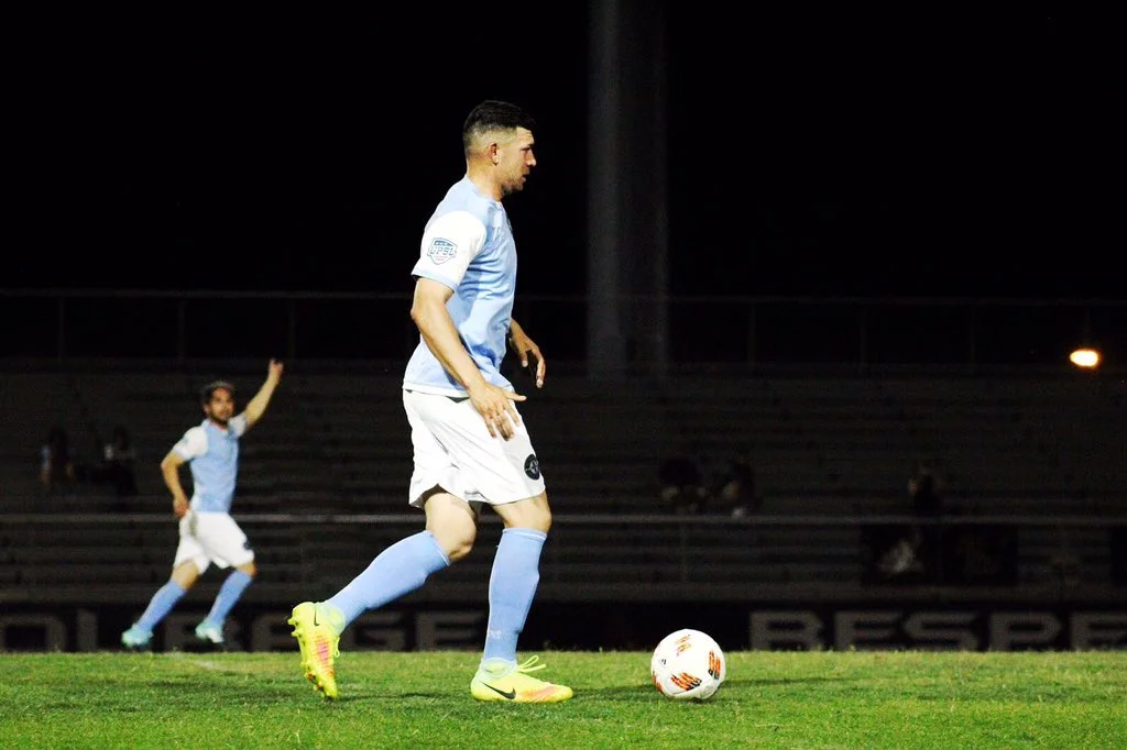
If you are not living in the Philadelphia area, you would be forgiven for thinking Lone Star FC was a Texan club. However, anyone in and around Philadelphia could tell you that Philadelphia Lone Star FC is an absolute institution in the city. The club was founded as Junior Lone Star FC in 2001 by Liberian immigrants, whose heritage is drawn on as inspiration for the “Lone Star” name referencing the lone star on the Liberian flag. The club has come to be known as one of the foremost professional development clubs on the east coast, growing from a single squad when it was founded to a club that fields teams in the NPSL’s Keystone Conference and the UPSL’s Northeast Conference. They’ve provided Philadelphia’s amateur footballers, and in particular those of African descent and heritage, with countless opportunities for further development in the sport.

This connection to Philadelphia fueled the club’s desire to rebrand last year and they adopted the name Philadelphia Lone Star. The club adopted a new crest to go along with its new name, ditching a “Barcelona”-shaped badge in favor of a cleaner pointed shield. The crest is not only a slick design, but it also does a simple design in a way that does not feel overly generic or unimaginative. The Liberty Bell is a simple homage to the city these players now call home but the club has not abandoned its own history in the process.

Philadelphia_Lone_Star_FC_logo.png

Lone Star FC took this connection to their city a step further as they prepared for the 2019 season by linking up with local kit designer Icarus Football. “Philly Lone Star is a big name around here,” said Icarus when asked about the partnership. “We really wanted to make sure we put together kits that would reflect their stature in the community.”

Based on the badge above, it would have been fairly simple for Icarus to look at this as a straightforward project. Red, white, blue...there’s 10000 high school, college, amateur, and professional soccer teams (not to mention the National Teams) in the US that use the same color scheme. Lone Star getting the template treatment that we see so often in major club and international football would have been simple. Icarus did not take that route whatsoever as they produced four fantastically unique kits.

Home

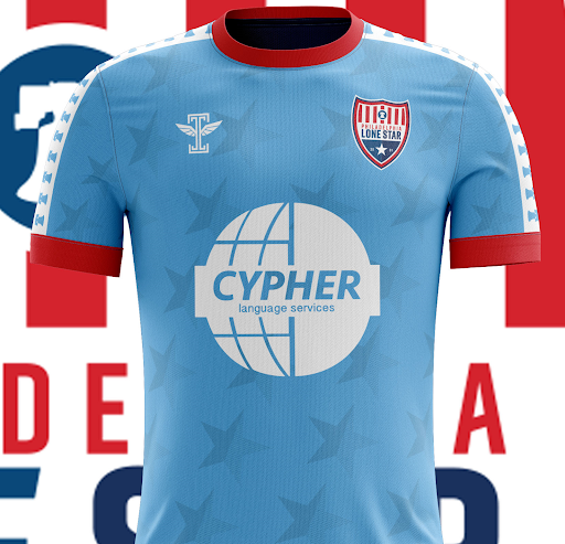
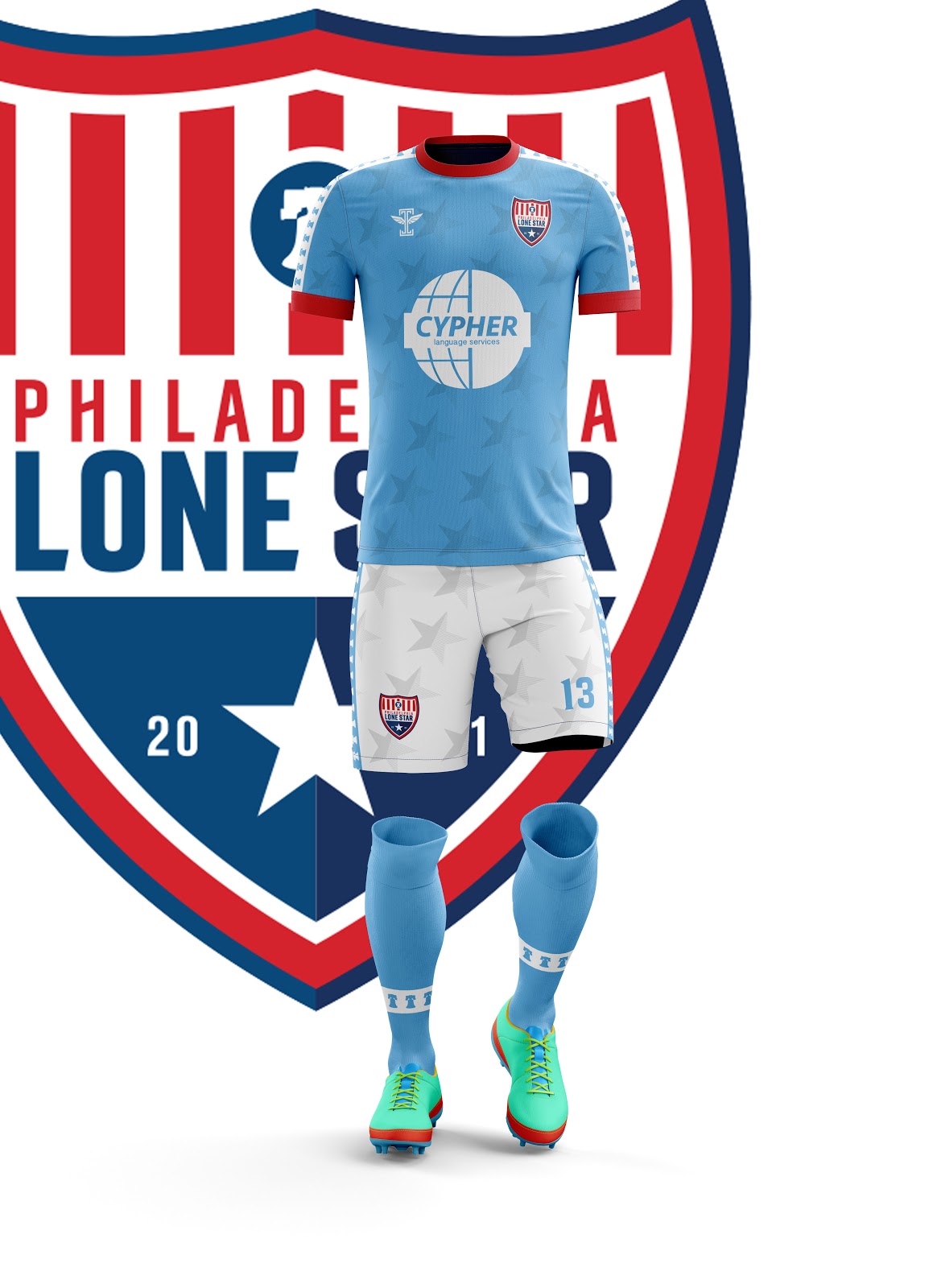
The impressive thing about this home kit is that it feels both familiar and unique all in one effortless stroke. Wearing sky blue with white shorts could have been a chance to look like a Manchester City copycat, but the Liberty Bells down the sleeves and sides of the shorts evoke a Philadelphia version of the classic Kappa designs from Serie A. The red trim pops in a way that you might not expect against the light blue, while the sublimated Star design makes it so Philadelphia Lone Star is embodied throughout the kit. An impressive effort from top to bottom.

Away

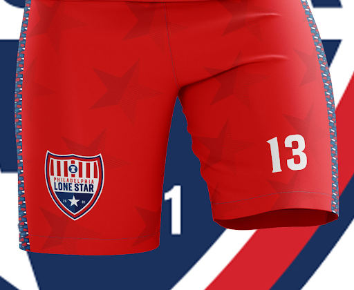
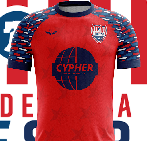
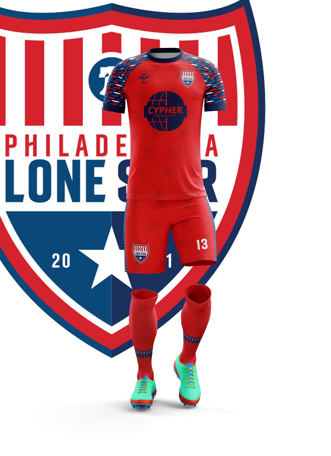
The Away Kit is another stunning effort. The red-over-red with the sublimated stars ties this design back to the home kit but it is the pattern on the sleeves and down the shorts that is the true star of the show here. We have seen, especially with Nike’s recent templates, the effort to make different colored sleeves the unique element of a kit. Icarus has taken that idea and cranked the creativity through the roof, implementing a pattern inspired by West African fabric patterns to create something truly splendid.

Third

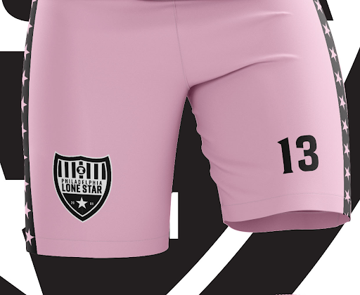
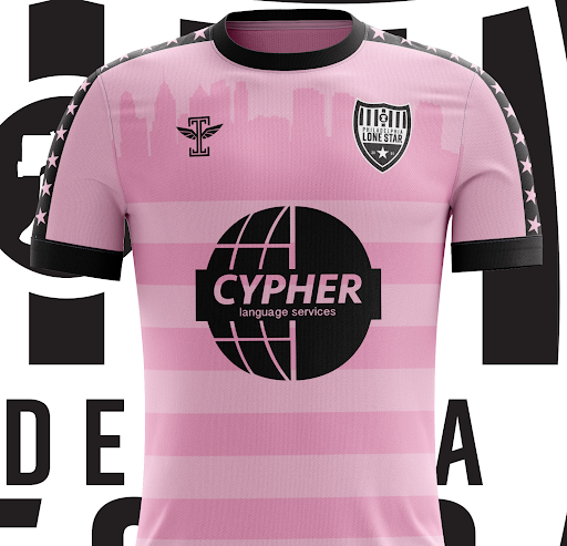
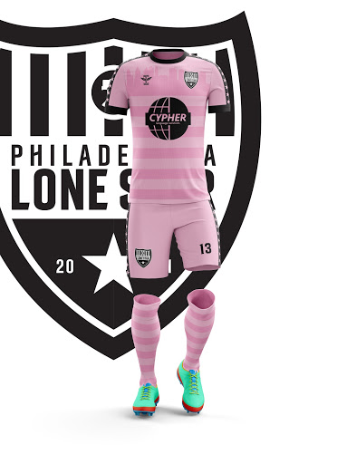
Philadelphia Lone Star’s Third Kit serves the dual function of being gorgeous and aiding a worthy cause. During the middle of the NPSL season, Lone Star will wear this kit in conjunction with a campaign to raise money for juvenile cancer research. Such a campaign should succeed on its own merits, but this design is a fantastic advertisement. The pink and black color scheme has an extremely modern feel to it without it feeling garish. The black and white version of the crest is, quite frankly, badass. The star details down the sleeves and shorts add a nice touch, but the sublimated design again steals the show, with a lovely hoop design culminating near the collar in the Philadelphia skyline. A kit that accomplishes this much both aesthetically and in helping those in need is extremely admirable and I hope this kit gets the attention it deserves.
Fourth

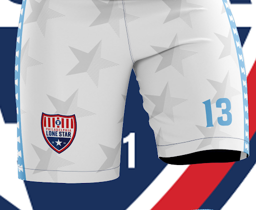
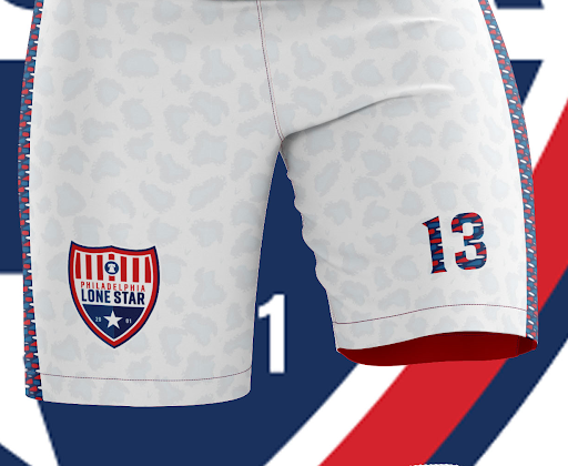
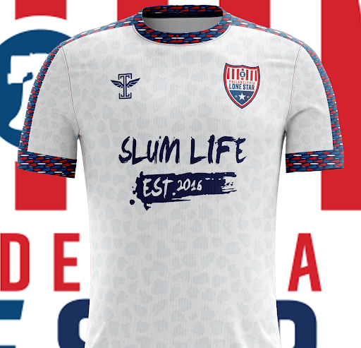
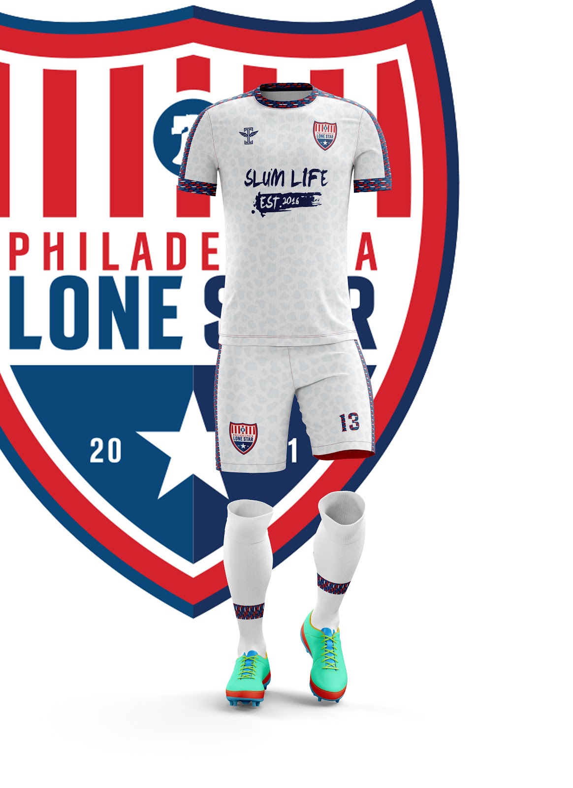
There is something so striking about a well-executed white kit. When that kit has a sublimated spotted print and a unique pattern down the sleeves, you have something special on your hands. The aforementioned pattern extends from the collar, down the sleeves, and down the shorts, with the numbers on the kit itself containing the pattern as well. This kit again brings Lone Stars African roots to the forefront. This celebration of the club’s heritage is evident in each design but this particular design feels like a celebration in and of itself. I, for one, am extremely here for it. This kit will act as a fourth kit for the NPSL squad and will serve as the UPSL squad’s home kit. This may be premature, but I would shortlist this kit for one of the best in UPSL for the Spring Season.

Philadelphia Lone Star FC are embarking on a new chapter of their history in 2019 and with this new identity that links their current home to the club’s African heritage, the club is emphasizing what we all love and idealize about the United States and the game of soccer: The opportunity to succeed no matter your background. This club is admirable for its ideals and history, and now we can all look on and admire the kits as well.

- Phil Baki


Kick It Off With a Bang

During the winter months, leagues take care of all the business that the regular season crowds out. League meetings, player tryouts, kit redesigns, almost anything you can think of happens when the weather outside is inhospitable in most parts of the country. One of those pieces of business is adding clubs. Whether through introducing a brand new club or adding on an established club who is jumping from one league to the next, expansion offers a spotlight on clubs, mostly through their crests (because most have a limited track record on the field). With all the announcements from league after league, we decided to put together a short list of some of our favorite badges from expansion sides this winter. Enjoy!

- Dan Vaughn


Dan Vaughn

Website-announcement-773x380+(1).jpg

Louisiana Krewe FC - Lafayette, LA - GCPL

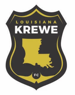
I’m a sucker for maps. The shapes of states, cities, countries, you name it, love that stuff. This crest features the shape of Louisiana on a gray/black background. The name of the club is featured above the state with the smaller “FC” below. Rather than a round shape, the crest is almost the shape of a police or fireman badge, with the three points on top and the single point at the bottom. The colors are very much in line with the NFL’s Saints, connecting the club to familiar territory for Louisiana sports fans. By the way, Krewe is a term for a group of people that put together a float in a carnival (much like in Mardis Gras). It’s a sharp badge and I can’t wait to see the uniforms that will feature it.

Steven Ramirez

1543361837_a.png

AC Miracle Hill - Desert Hot Springs, CA - UPSL Western Conference

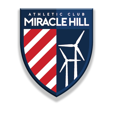
If you live in Southern California and have made the drive through the desert, you have been faced by many giants that ruled in Don Quixote's time. The Southern California desert hosts a wind farm that contains over 4,000 windmills and is known to many travelers. When creating a crest for this Desert Hot Springs club, nothing makes more sense than those towering windmills. Using the “Athletic Club” moniker applies a traditional naming convention that is sporadically used in the world, especially in the U.S. soccer sphere. In their first year of existence this UPSL crest jumps out as one of the best in the league.

Aarik Long

220px-Chattanooga_Red_Wolves_SC_logo.svg.png

Chattanooga Red Wolves - Chattanooga, TN - USL League One

I was at Edley’s BBQ on November 15th to witness to unveil of this logo for Protagonist Soccer.  The atmosphere inside of the restaurant was incredible. When the crest was finally unveiled, there seemed to be a positive response inside the building. However, people have seemed to not agree online. It’s been mocked repeatedly, but I think it’s a great crest. To begin with, I love that red is the primary color. It’s pretty common and maybe a little cliche, but there’s nothing like a cross-town, red vs blue rivalry. The wolf looks great. It isn’t a goofy cartoon canine, but it also is not overly realistic. The overall shape of the badge looks really nice, as well. The spikes at the bottom aren’t very common among crests, so the unique shape is refreshing. Some of the reasonings behind different parts of the logo seemed like a little bit of a stretch, but I think the crest itself is extremely solid and among the best in USL League One.

Dab Williams

CCFC_Logo-e1538156738340.png

Contra Costa FC - Concord, CA - UPSL

The round of expansion teams for Spring 2019 hasn’t impressed me much, honestly. Don’t get me wrong, they might be great on the field, but artistically and stylistically I’ve been underwhelmed. Contra Costa FC was a breath of fresh air. CCFC’s badge is in the shape of the Union Pacific logo and features a similar design with the white and red stripes across the base of the badge.  The top of the badge features some mountains, the name and, outside the limits of the badge, is the star, which I assume is from winning the Liga NorCal Copa Cup championship in May 2018. Across the front of the crest is a soccer ball with wings (not my favorite feature of this one), completing the look of the badge. I love the color palate, love the shape, it’s the best of the UPSL expansion clubs, without a doubt.