FC Burlington
Icarus is a sponsor of this column, but had nothing to do with the subject choice for this article. They are just really good at what they do.
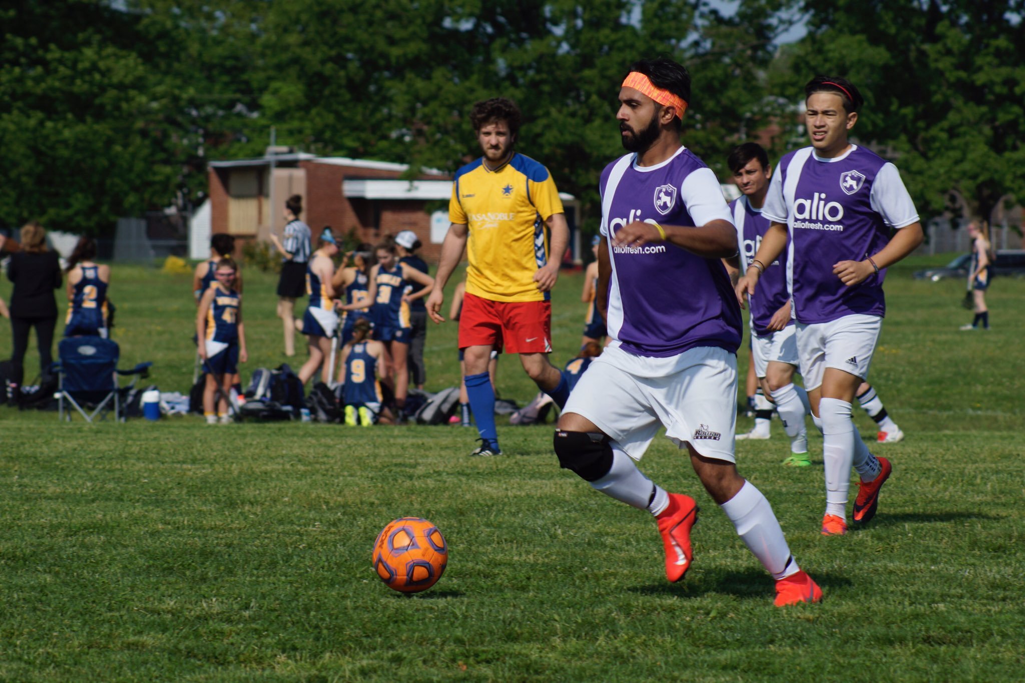
The Casa Soccer League is one of the large local soccer leagues that are gaining traction all over the country. Originally founded in Philadelphia in 2005, the league is now a powerful regional league, with 10,000 members in over 300 registered teams in 2019. According to the league website, Casa is now “the largest independent amateur soccer league in the USA.” But many leagues like CASA slip under the radar of the national soccer media due to our overfixation on the large national leagues. Today, we take a look at one Casa club that just got a brand new look thanks to a big name in grassroots soccer kit design. I sat down with Saulo Loor, co-founder and team manager of FC Burlington, to discuss his club and their kit redesign.
“The team started of as an idea between me and my friends Allan Loor (my brother), Robert Bell and Devante. We all were talking about creating a soccer team to play so we looked into at first just making an indoor soccer team but as we were asking people to join we realized that we got more responses of people willing to join the team than we thought, so we decided to join casa soccer as an outdoor league team. So from there we created the team and started our first season in casa as Burlington Sporting Club, we named the club after our town we live in Burlington Township.” After a season under their belt, they followed the naming tradition of so many American clubs: following the European model. “We just went to a name change to Football Club Burlington to make it sound a little more elegant and make more European sounding.”
Burlington’s old kits were pretty solid. But they wanted a big change.
With a new name, the team decided to go for a new look. And after being contacted by Icarus FC, it just made sense to collaborate with them. Because of Icarus’ work with so many other grassroots soccer club, the proof of the quality of work is all over regional and local league all over the country. For Saulo, it just took a quick visit to his phone. “After looking at their Instagram page, seeing all those awesome designs they brought to life, it was a no brainer that we wanted to work with them.”
The kits that Icarus designed really pop and will stand out in any league, but especially in a league that features so many other clubs fighting for attention in Casa League. The plan for the redesign began with the club founders meeting to discuss ideas. “We sat down one day and brainstormed ideas about how we could make a kit that was classy and simple so we decided on the colors of our own high school (Burlington Township HS) so that’s how we ended up with black/gold kit and the white gold kits.” Connecting the kit design to a local, establish color-palate is a smart move, the third “alternative” kit was chosen for less obvious reasons. “The olive green jersey idea came from us just thinking about sick colors that you don’t see to often on soccer jerseys so we thought why not an army/olive color and we ended up deciding that would be our third kit this season something different than the norm.”
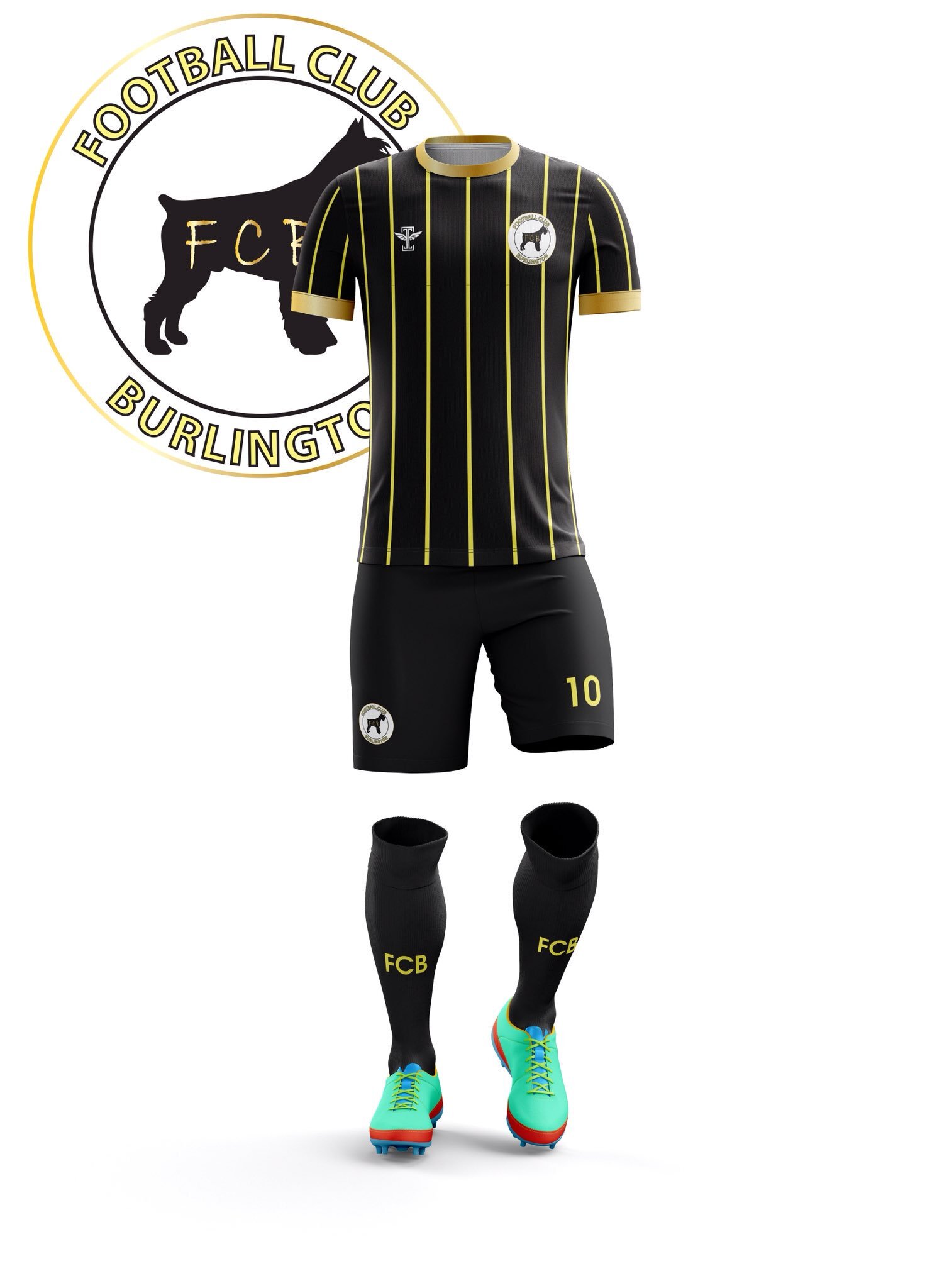
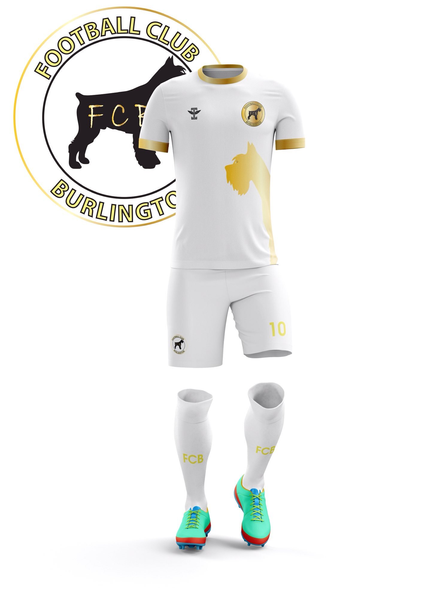
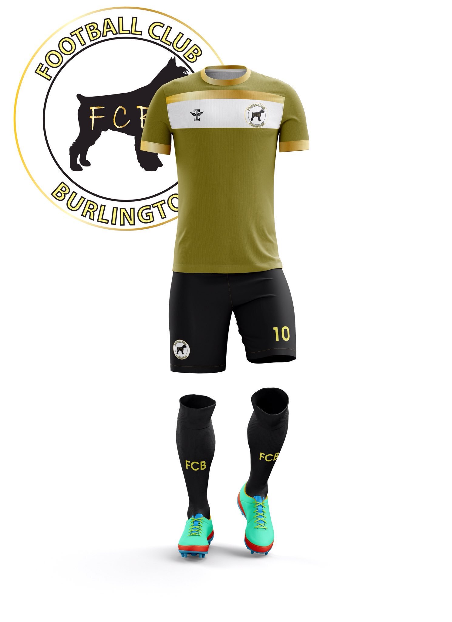
What catches the eyes of soccer fans all over the world is their logo, featuring a fierce black dog. For Saulo, this was also drawing from local inspiration, REALLY local. “Our dog logo and dog outline on our jersey actually is about my schnauzer Beamer that I got 2 years ago. I always wanted a schnauzer and 2 years ago I finally got one and thought it would be pretty funny to incorporate him in my soccer team some way so I ended up putting him in the club badge and since then he’s been the team mascot. The badge was designed by my cousin Abraham Olmedia and my father Saulo Loor sr. So shout out to the team for bringing my idea to life.”
For the players on the club, the new look was exciting and they couldn’t wait to throw the new kits on. Particularly from Saulo’s perspective, the new design is really all about the many people involved in its creation and the club itself. “I just want to thank everyone that has helped out over the years to make this soccer team a possibility because once you find out how much you need to put in to run a soccer team you understand how much goes into it. I couldn’t imagine the stuff GMs go through for a professional team, it’s probably insane.”
As with all the designs we highlight on this site, you can contact the club to purchase one.


