FCM Portland: A Fraternity with French Design and History
Continuing with our NPSL pre-season coverage, we stay out west for Uniformity this week and check in with 2018 semi-finalists FC Mulhouse Portland. Head Coach Sergio Medel was happy to tell us about the design on the shirts of his talented players from the Northwest Division. We haven’t seen a kit from Patrick yet and I was very curious about why a team from Portland, Oregon ended up with custom shirts from a relatively small sports apparel company based in Belgium.
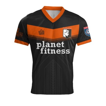
Both the Blue and Whites kits from last year are bold and unique, what was the inspiration? Will there be a new kit for 2019?
The kit designs are the same as the partner club in Mulhouse, France. The Wheel design is the emblem of the City of Mulhouse found in all the city logos. There won’t be a new design until the 2019/20 season in France which begins in August of 2019.

FCMP’s Jay Garmondeh (right) decked out in the club’s primary kit taking on a Kitsap Pumas player during a NPSL Northwest matchup (Photo: Kitsap Pumas social media)
How long was the process of design and choosing the right kit provider? Did anybody at the club get to help in the design process or does Patrick have a design team that does that work for the club?
The design and production with Patrick (the kit company) takes approx. 6 weeks. The Company is based in Belgium. The kit was designed by the club in France via sketch ideas, then the designers of Patrick sent Digital and eventually hard samples of the design.
I don't see Patrick used in the United States very often, why did you settle on them? What's the connection to FCMP? Did Patrick provide more than just kits? Training equipment too?
The partner club in France Football Club Mulhouse is the one who has the connection with Patrick and therefore FCM Portland as well. Yes, Patrick provides more equipment for the French club, balls, goalie gear, pennies etc. Portland primarily uses the kits and warmup clothing.

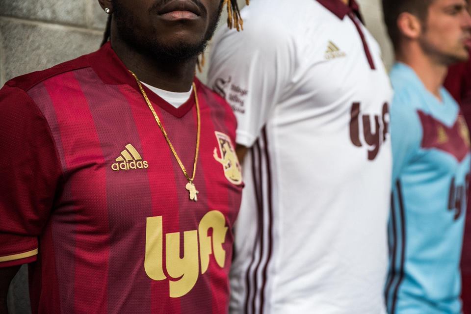
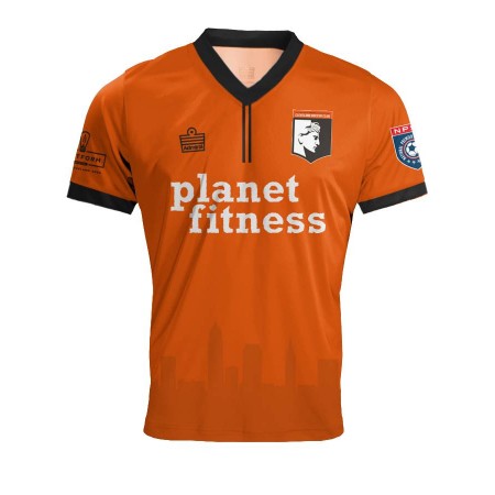
The club’s secondary kit, custom designed for both FC Mulhouse clubs, on display before their 2018 Seasons. (Photo: FCMP Social Media)
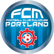
Could you explain the history and meaning of the badge and the Portland club’s connection to the French side in Regional Ligue 3?
The badge was designed in France and again contains key elements to the history of the club which began in 1893. The emblem contains the wheel of the city of Mulhouse. This was a new logo for the club in France beginning when American Owner Gary Allen purchased the French club in January of 2017. Gary was the President of the Portland club prior to turning it over to me as the new President of FCM Portland. I and the Portland club have a license agreement to use the logo and kits in Portland.

Club badges worn over the history of parent club FC Mulhouse of France’s 3rd Division—the wheel or cog is derived from the city’s coat of arms and represents the city’s historic connection to the textile, machinery and railroad industries.
If somebody wants a FCMP shirt, are they available? If so, where?

Originally founded in 1892 as Patrick-Chaussures Techniques, Patrick now provides sports apparel to a multitude of organizations around the world, from Honduras to Kosovo and from Panama to Portland, Oregon. Both Kevin Keagan and Michel Platini were famous for wearing Patrick in the 1980s before the company decided to step out of the sponsorship wars over big time clubs and players. They are based out of Belgium and are the official apparel providers to the Belgian referee association.
Fan gear is available from France to include jerseys, beanies and scarfs all of which contain the logo and designs of the French club, almost identical to Portland so we are looking to integrate the same system locally.
For more information on FCMP, visit this site.
To Purchase a FC Mulhouse Kit from France
- Joshua Duder